Explore your city’s vibrant canvas, with a mobile app that allows you to discover & register in local art programs & events.
The Art Spot

Role
UX/UI Designer & Researcher
Tools Used
Figma, Google Apps
Timeline
10 weeks
Project Type
Conceptual
Skills
User Research, UX Design, Interaction Design, Visual Design
Project Overview

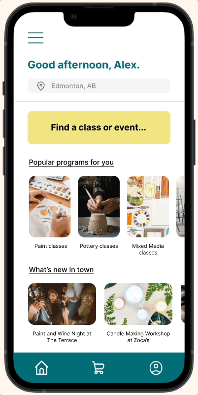
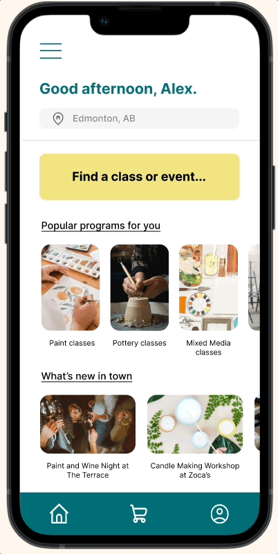
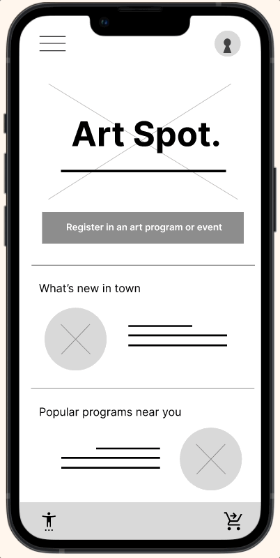
Homepage of The Art Spot
Featured Events happening in town
Users can click for more event info
This project is based in the city of Edmonton, Canada, where there is a gap in accessible mobile platforms that can seamlessly allow residents to discover and register in these programs.
→ The Art Spot is aimed to be a mobile app that helps people easily find and register into art programs and events happening locally in their city.
🤔 The Problem
There is a lack of mobile apps that allow individuals to discover local art classes and events while also providing a direct registration feature within the same platform.
✍🏻 The Design Challenge
How can I create an app where people can seamlessly register in art programs & events across the city, all through one platform?
Here comes the proposed solution.
The Art Spot makes discovering art programs and events in town the easiest part.
Explore ongoing and upcoming events, register effortlessly, and stay connected with your local art scene. Discover and engage with the latest classes offered in your area, while fostering a vibrant local art community.
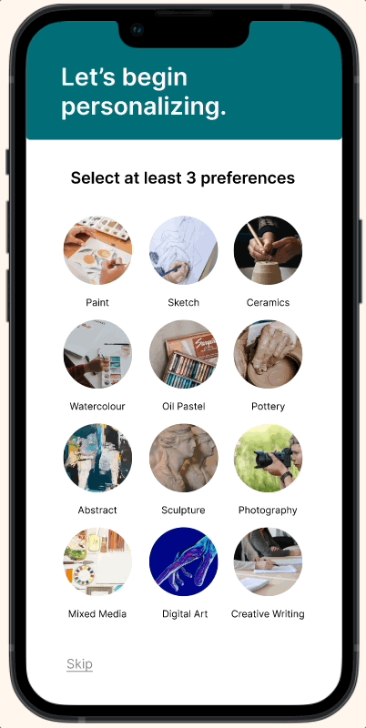
Main user registration flow for finding programs in town
The Impacts
✅ All 5 of 5 users interviewed said that it was easy for them to locate and register for art programs and events
⚙️ All 5 of 5 users enjoyed the ability to choose preferences and explore art events happening in their city
📱 All 5 of 5 users agreed that the user interface was visually appealing and inclusive
What makes the Art Spot unique?
⭐ 1 - Easy search tool
Users can easily search for nearby programs and events happening near them with a 3-part search customization tool.


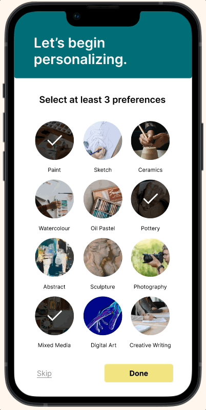
⭐ 2 - Choose your preferences
On app start-up, users can customize their app experience and get programs and events catered to them by selecting their preferences, or they can do so later in their profile settings.
⭐ 3 - Discover what’s new & popular in town
Users are connected to art events happening in town, increasing community engagement in the arts and other local art businesses and organizations


⭐ 4 - Inclusive Accessibility Options
Translation options, Text size adjustment and more, allowing for all to engage in local arts.
How did I get here in the first place? ↓
The Research Process
I interviewed 5 participants and asked about their past experiences with course/event registration, and their level of involvement with engaging in the arts.
💡 Key Takeaways
There is a need for accessibility. 🫱🏻🫲🏽
A large portion of current platforms are not sufficiently equipped with an inclusive range of accessibility options and assistive technologies.
Registration programs have been difficult to use. 🖥️
Users said that the local existing program registration platforms in Edmonton such as movelearnplay.edmonton.ca, involved too many clicks and re-directs, making it harder for a seamless user experience. This can reduce feelings of organization and ease of mind for users.
Some interfaces of these programs often have poor interfaces. 📉
Often, these existing apps like the one mentioned above can be too text-heavy. There is a need for increased visualization aspects including micro-interactions for user feedback, to promote a sleeker interface and improved experience.
🎯 Establishing Goals

⭐ First Goal:
To ‘complete’ the core tasks = user reaching the confirmation screen that reiterates registration details.
‘With ease’ = users complete core tasks with minimal clicks, without running into any sections of the process where users get stuck,
User feels that the overall process was clear, logical, easy and experienced positive emotions during their experience
🎯 Second Goal:
A rather personal goal, my initiative to increase engagement with the local art community in Edmonton, while supporting local businesses as a whole.
The first 2 Research Goals were very broad. I broke down each goal further:
The Design Process
For my design approach, I followed several key principles:
🎨 Maintain the personable aspect of design.
Users like the person-to-person interaction, design should promote maintenance of this personal aspect through the human-computer interaction, which helps to improve user experience
By giving users the ability to pick their own preferences and making their own choices, it enhances their experiences and helps empower them.
📱Keep the interface light and simple.
Ensure there is an equal balance of visuals and text. A picture is worth 1000 words. It’s easy on the eye, and it draws attention.
Use white space efficiently to maintain user attention, minimizing their cognitive load.
⚙️ Make Accessibility, accessible.
Ensure accessibility options, user personalization and help information are placed in a logical, easy-to-find location
🎨 Style Guide
Colour Palette

Typography


Format
390 x 844 (iPhone 13/13 Pro)
🤔📱 Why that format size?
I decided this format as during this time, this was one of the common iPhones that people had at this time (2022), according to Counterpoint Research. It is also similar to 360 x 800, the most common phone screen resolution as mentioned on Stat Counter - Global Stats from (Dec 2022 - Dec 2023).
💡 Ideation Phase

The registration flow is the main flow of the Art Spot. I wanted to create a process that was as simple and intuitive as possible, without taking away any features that allowed users to personalize and refine their choices in search.
There were several iterations when drawing out the home-screen. I wasn’t quite sure about how simple; minimalistic or bold I wanted it to be—whether I should make the logo the forefront of the home-screen or just a simple button instead.
Paper Wireframing


Example wireframes of home-screen iterations
Next, I translated the wireframes into digital ones and iterated some homescreens.
Favourable elements from each wireframe have been marked with a green star.

No search bar or visible registration button
Users are limited to ‘art form’ choices on the home-screen
✔ Visual emphasis for user engagement

Users are limited to choices on the home-screen, would need to navigate app if what they’re looking for isn’t visible
✔ Visual emphasis for user engagement
✔ Allows and informs users to explore local art programs and events near them

Menu bar at the top and bottom of screen can be excessive
✔ Search bar on top so users can search for what they want
✔ Easy list view of available classes and events

No search bar or visible registration button
Scrolling interaction required to navigate home-screen
✔ Visual emphasis for user engagement with large use of photos
✔ Expandable menu bar icon on bottom right
No search bar or visible registration button
✔ Personable aspect for user
✔ Page format engages user, easy-on-the-eye formatting
✔ Expandable menu bar icon on bottom right

Usability Testing #1
After the low-fidelity prototype was created, Usability Testing #1 was conducted, with key findings below.
Main User Flow (LOFI prototype): Finding and registering in a program
Positive Feedback
👍🏻 All users (5 of 5 usability study participants) found the main user flow of registration simple, easy and logical
✨ Users enjoy being able to discover new and popular events near them
🎨 Users liked being able to choose their preferences in their profile
➕ They liked the option of the add-ons to enhance their experience
Areas of Improvement
❌⚙️ The accessibility logo on the home-screen was not easily identifiable,
✅🔍 Accessibility logo should be in a location that can be easily spotted
Usability Testing #2
During this new round of mockups, major changes and additions were made based off of the key findings I had discovered.
User Personalization enhanced user experience. 🎨
Individuals enjoyed sections where they were able to choose and personalize the app to cater to their interests, such as the profile section and user preference selection upon app-start-up for first-time users.
Micro-interactions gave the feedback the users needed. 👆🏽
In previous interviews, individuals mentioned that when they press an element, no feedback is given and they are unsure if their action worked. Adding micro-interactions enabled positive user feedback, increasing satisfaction and overall user experience.
Accessibility options should be identified & found in a standardized location. ⚙️
During the usability testing, some individuals had a hard time identifying the accessibility options - there is a need for a universal logo. Most users went through the setting options to find this, so I made sure these options were embedded into the settings.
💡 Key Takeways
Additional features that help empowered users & their experience:


Complete revamp of home-screen layout to include main core functions of the app and contain user personalizations
The ability for users to select their preferences on app start-up, as well as through their profile settings later

Relocation of “About Us” section, can be navigated through menu bar, so it does not take away from key content of homescreen

Relocation of Accessibility options to settings, showing inclusive options
Micro-interactions added (loading pages, after curating for user selections), to give user more feedback

Improved user flow details - Search has map option and location search bar, classes have ratings to help users choose better

Key features of the revised home-screen:
✅ Allows preference selection on app start-up, to cater to individual personalization
✅ Menu bar and profile icon remain at the top
✅ Personable message when people log in
✅ Ability to customize location settings to find best-suited programs and events near the individual
✅ More visible articles that are curated for the individual
✅ Balance between visuals and text to minimize cognitive load, while appealing to the person
Key Qualitative Findings after each round of usability testing:
Usability Study #1
Usability Study #2
"I think this app is something I would use frequently when looking for things to do in my city."


"I found the app overall easy to navigate."


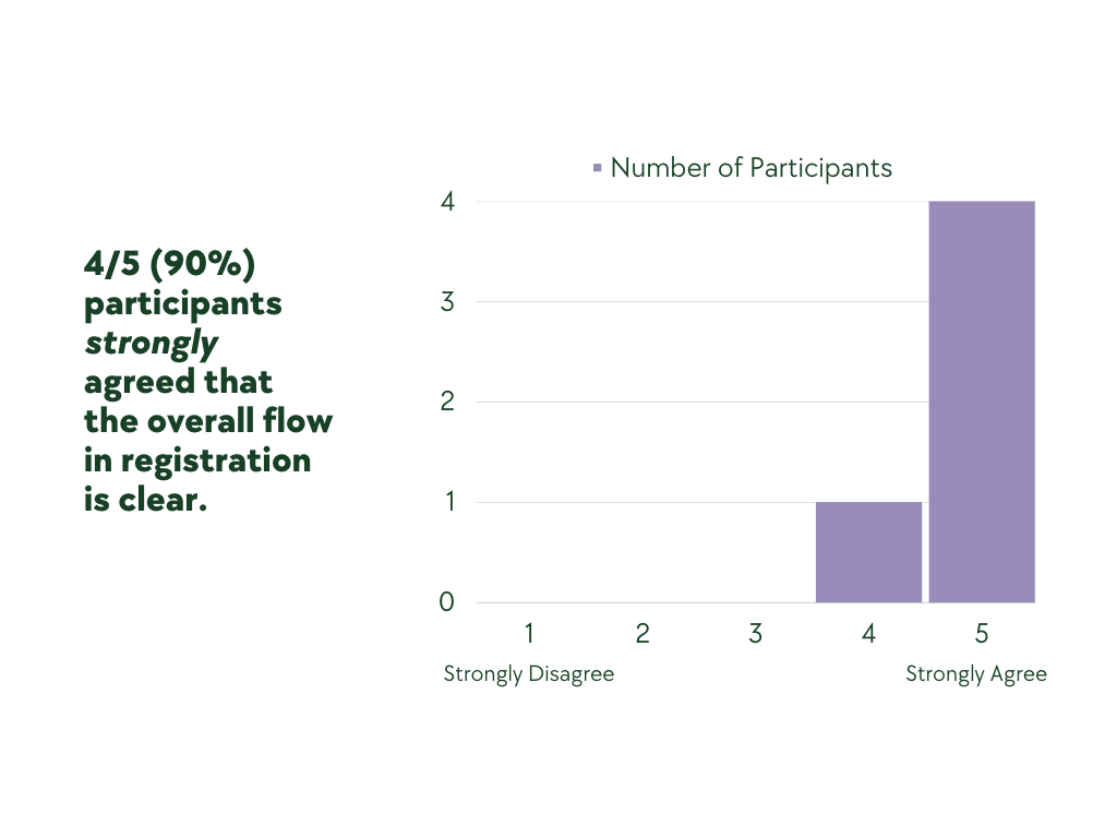
"Overall, the main user flow in registering in a local art program or event in the city is clear."

The Final Product

Major Takeaways:
📱 The Art Spot became an app that now only allows users to find/register in classes and events near them, but does so in a way that is inclusive to all while empowering users through their choices.
I did so by:
✅ Creating a seamless flow that allowed room for user personalization
✅ Ensuring accessibility needs are met by
✅ Enabling various forms of positive user feedback, such as
Micro-interactions during loading phases
Confirmation Screens
Use of bold colours for important call-to-action buttons
Lessons Learned 💭
Giving users control over their experience improves it 🎮
Through this project, I learned the importance of giving users the ability to customize their experience by including several flows where they select their preferences. This played a key part in empowering the users.
The importance of accessibility! 👐🏻
Not everybody knows what accessibility includes, and the logo to identify it. I found that there is a gap in this knowledge, and need to identify a universal logo for this.
For Next Time
Inclusion of a wider range of users during testing 🔍
For next time, finding more diverse participants from various backgrounds, age levels, and involvement in the arts can help make more meaningful insights into the real-world, and help with product development to be even more inclusive.
So…What’s Next? 🤔
Design pass-off to potential developers to launch the product 📲
Expanding this product beyond Edmonton, but for any city that lacks it. 🌐