

Refreshing the Online Experience of Aspire Counselling & Psychology
Role
UX Designer & Researcher
Timeline
June 2023 - November 2023
Tools
Figma, WIX, Hotjar, Google Apps
Skills
User Research, UX Design, Visual Design, No-Code Development
Project Type
Shipped
Project Overview
💭 Context & Client Goals
Aspire Counselling & Psychology is a psychology office based in Spruce Grove, Alberta, CA, which offers various types of counselling services to a wide range of individuals. They wanted to refresh their online web experience by updating their branding while making the entire website more visually appealing, and intuitive and increasing their client base while promoting online appointment bookings through their site.
✍🏻 Design Process
Competitive Analysis/Audit
User Research, including interviews
Wire-framing
Low-fidelity & High-fidelity Prototyping
Mockups
Interactive Prototypes
Usability Testing, System Usability Scale
Transfer to WIX with no-code development
Problem
How can I revitalize Aspire Counselling & Psychology's website to refresh its branding, improve user experience, and boost online bookings?
↓ Scroll down to read more about the business & design goals ↓
Previous Site Version
The previous version of the site appears outdated, and the colour palette appears dull, with some elements being non-responsive or hard to navigate.
Additionally, there is a lack in responsive web-design.

Welcome to Aspire’s Brand New Online Experience.
A modern, sleek, and more elegant approach to the branding of Aspire Counselling & Psychology.
All while ensuring the peace of mind of present and future clients.
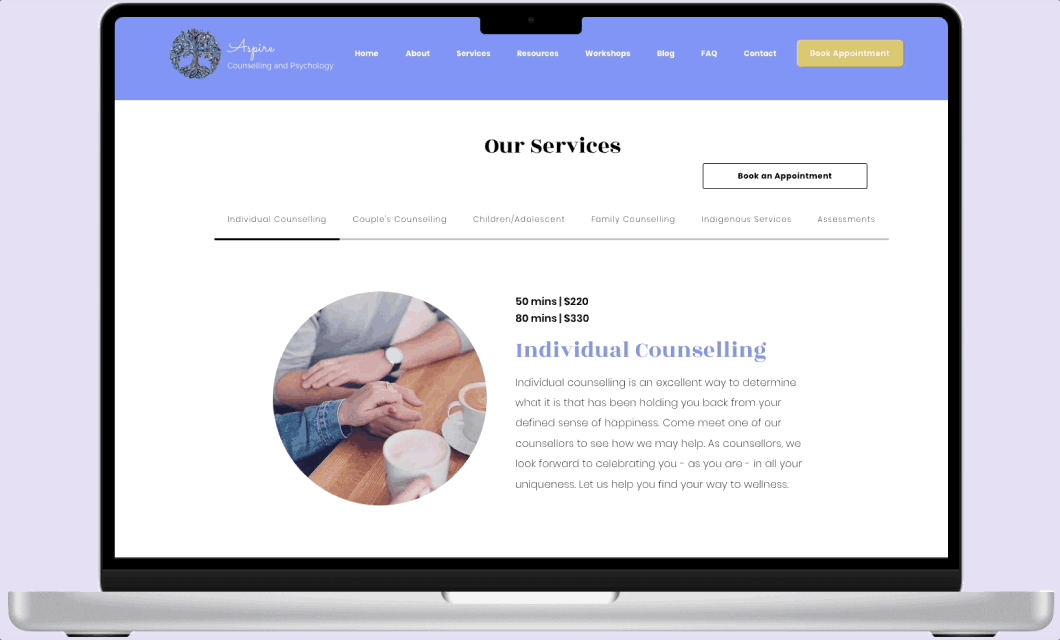
✨ A compact ‘Services ‘ page feature where users can navigate through tabs without extra re-directs ✨
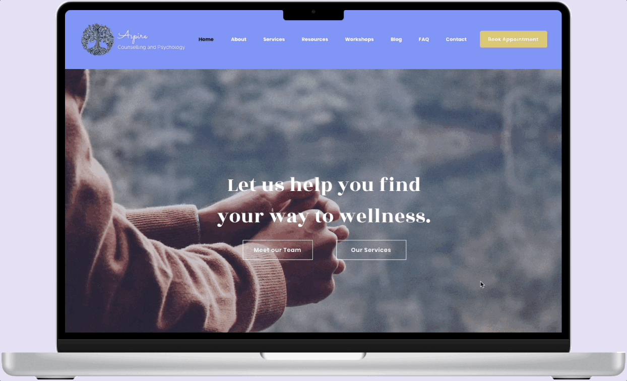
✨ Interactive homescreen as users scroll, giving users a feel for the atmosphere of Aspire while learning of their services and featured workshops ✨
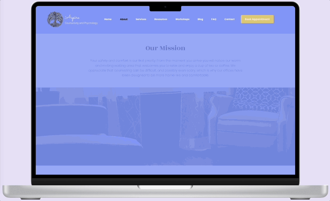
✨ An easy-to-use, seamless & visual-heavy interface especially for the ‘About’ section, allowing future and current clients to feel confident & comfortable with their experience ✨
But wait, there’s more… See the live site here
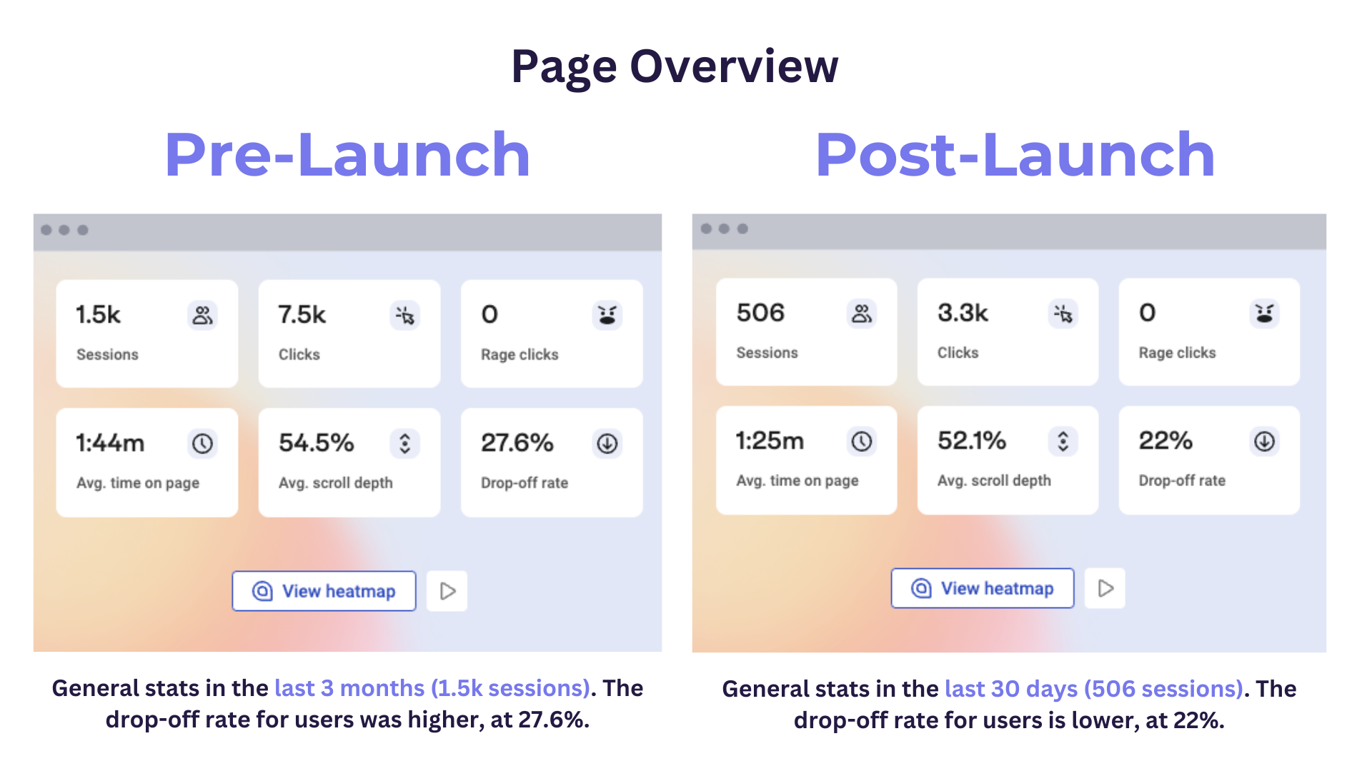
The Impacts

Pre and Post-Launch of The Site
👉🏻 The new website went live on November 13th, 2023.
👉🏻 Here are some comparisons before the launch (last 3 months), and after the launch (last 30 days, captured as of December 12th, 2023).

🌟 Testimonials
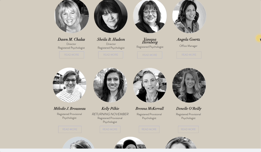
“We’re so pleased with our whole experience and the outcome of our website refresh. Not only was Vivian kind, patient and professional when dealing with our very busy team, the outcome of her work is one we are all so proud of. Thank you!” - Dawn C., Sheila H. (Directors at Aspire Counselling & Psychology), Melodie B., (Psychologist at Aspire)
“I know a lot of hard work goes into a major revision like this - good work… Looks professional and user friendly - doesn’t get any better than that!” - Zelda K. (Registered Psychologist, Contractor)
↓ How was I able to get these results? Scroll down to dive into my thought & design processes ↓
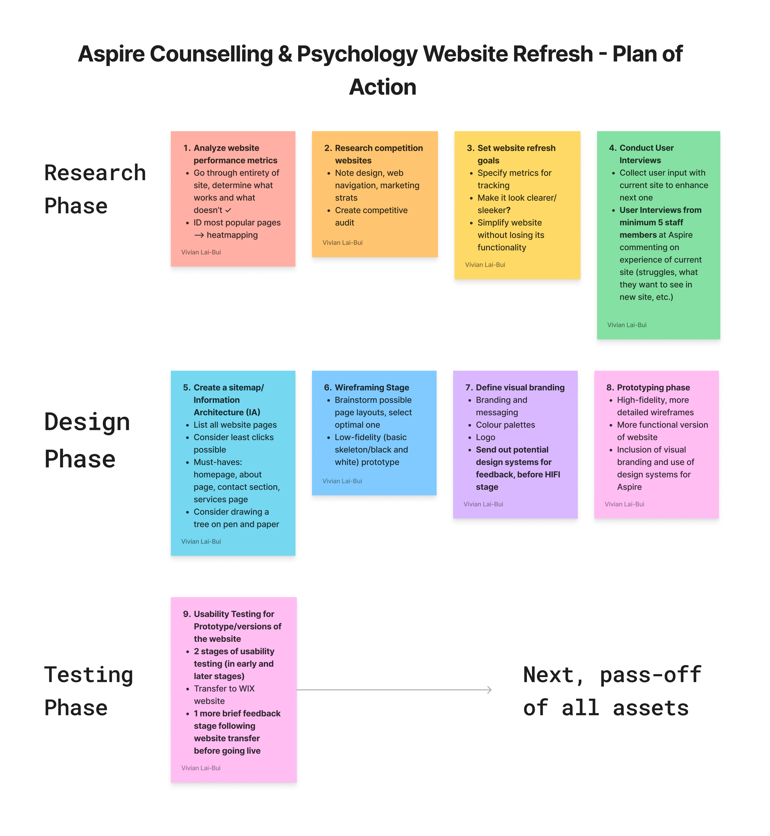
Plan of Action
In the my meeting with the client/stakeholder, we discussed the UX Road Map in completing this project.
Taking a Deeper Look Into User Behaviour, via Hotjar Analysis
For the first week before the design process, Hotjar was implemented into the existing website to:
Track anonymous user-session recordings
Create heatmaps of common areas of the current website that users interacted on

An anonymous user session recording captured via Hotjar of the old website version, taken Oct. 24, 2023 (Canada).

Heatmap (Move Map) of homepage. Most clicked-on area was the menu bar, specifically “Services”, “About” and “Fees”.

Heatmap (Scroll Map) of homepage. Less than 50% of users will scroll down to the bottom of the page, indicated by cooler to grey colours as compared to the top.
Creating Connections - Empathizing with Users
5 user interviews were conducted, where we discussed what worked, what didn’t work, thoughts, feelings, emotions evoked, and more.
💭 Key insights mentioned by staff during the interviews
💭 “I like the pages that are the shortest, because I am not a person that will keep scrolling." - Melodie B.
💭 “The homepage needs to be 'perfect'... it's the first thing that we click on... [people's] first interaction." -Vanessa H.
💭 “We need more social media presence... people's attention spans are way smaller, shorter." - Brenna, M.
💭 “[You would] have to dig too much... in finding the specific counsellor or service." - Dawn, C.
💭 “[Aesthetics-wise] the colours evoke another emotion... it reminds me of Eeyore, gloomy." - Denelle, O.
Defining the Business and Design Goals
I met again with the client and stakeholders of this project, to discuss business and design goals and metrics.
🎨 Design Goals
Enhance website navigation to make it easier
Make the core user flows more intuitive (from finding staff to booking appointments)
Refresh the website branding of Aspire through aesthetic considerations (font, colour palettes, etc.)
🤑 Business Goals
Increase client base
Increase number of online bookings
💡 Ideation
Information Architecture for the Aspire Website

Staff interviewed at Aspire emphasized that they wanted their online experience to be easy for the clients, as they are already coming in overwhelmed enough - it shouldn’t have to be an extra step to help.
To promote online bookings, we discussed creating a matching tool where future/current clients can ‘Find a Therapist’ following a certain flow.
User Flow for ‘Find a Therapist’ Matching Tool
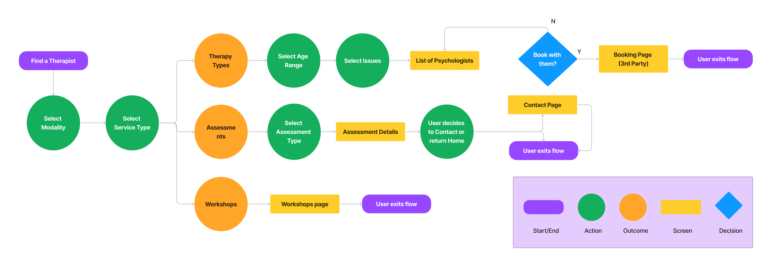
By having this tool, it will serve as one of the site’s core features, in hopes of promoting user ease, especially with a clientele consisting of incoming clients seeking therapy services.
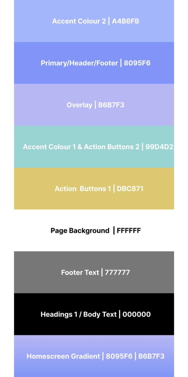
Design System
Colour Palette
Typography

Format

1920 x 1080 (Desktop)

360 X 800 (Mobile Phone)
🤔📱 Why this size?
According to GS Stat Counter, this is currently the most common phone screen resolution worldwide.
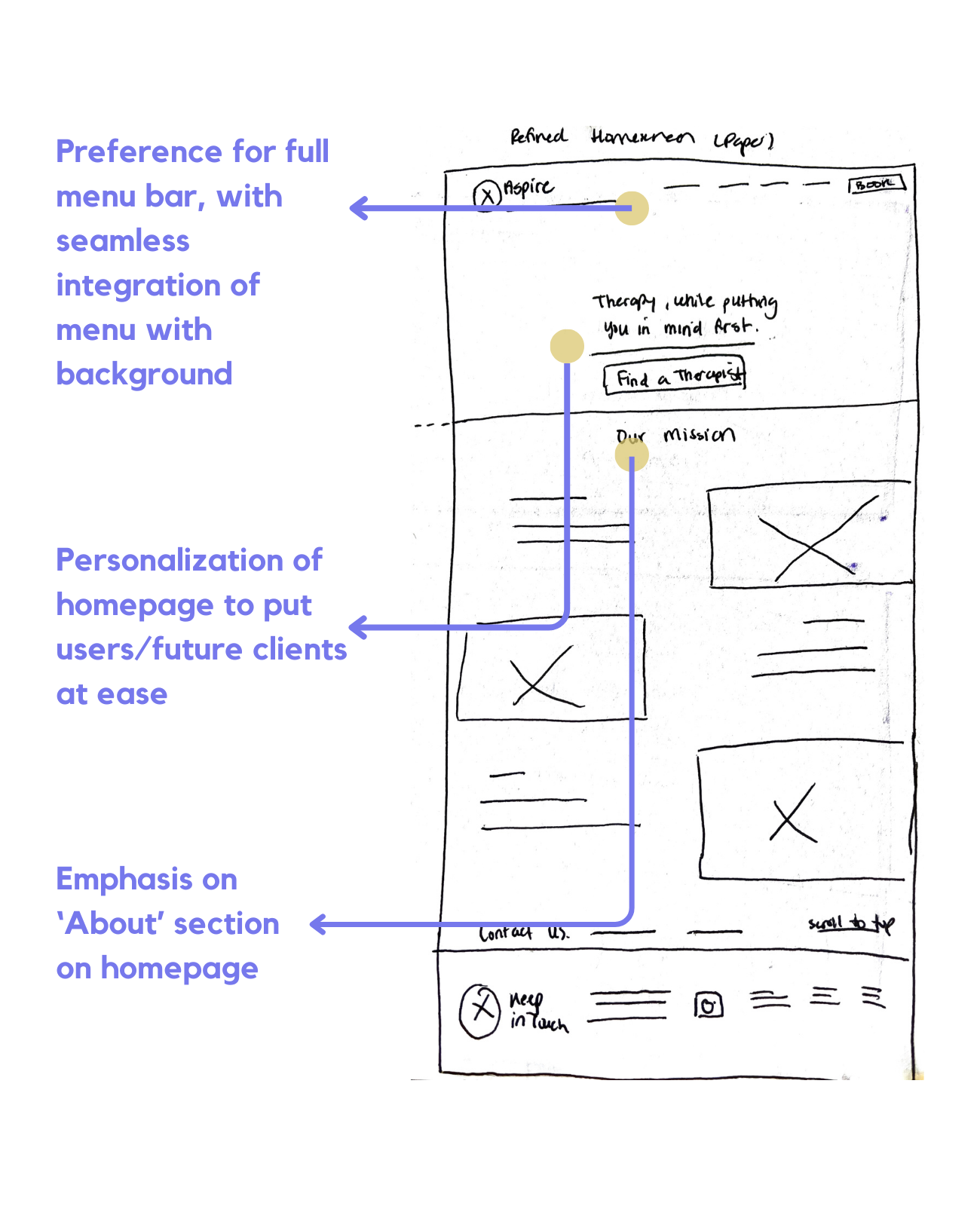
✏️ Refined Homescreen Concept
One of the goals a staff member mentioned during the user interviews was to emphasize the importance of creating the ideal homescreen.
“...it’s the first thing that we click on... our first interaction” - Sheila H.
After 5 iterations, I decided on this final home screen concept.
Low-Fidelity Prototyping with the Digital Wireframes
LOFI user flow of the ‘Find a Therapist’ concept tool
👩🏻💻First Round of Usability Testing👨🏽💻
After bringing all paper wireframes to life by creating the digital wireframes, they were stitched together to create an interactive low-fidelity prototype.
Usability Testing #1 was conducted, involving 3 staff and 3 non-staff members (unrelated to the project).
⭐ Key Findings
🤔 The ‘Find a Therapist Tool is good as an additional feature of the site.
5/5 of users agreed the tool was useful, however mentioned it should not be at the forefront of the site - their services offered should be instead.
🎯 All core tasks/features of the website should be displayed as soon as they land on the site.
5/5 of users agreed they were easily able to find what they were looking for, without the aid of a technical person. 5/5 of users also agreed that the navigation was easy and straightforward.
✖️ However, not all users agreed that the homepage was not yet eye-catching
1/5 of users did not agree that the homepage was visually appealing to the audience. Staff also mentioned they prefer a sleeker and uncluttered interface. More iterations were needed to perfect this.
Implementation of Key Findings from Usability Study #1
Below are some examples of the high-fidelity wireframes. Because the client was already using WIX as their choice of website builder on the current site, I had to keep in mind to cater to the WIX templating while making my design choices.

Homescreen
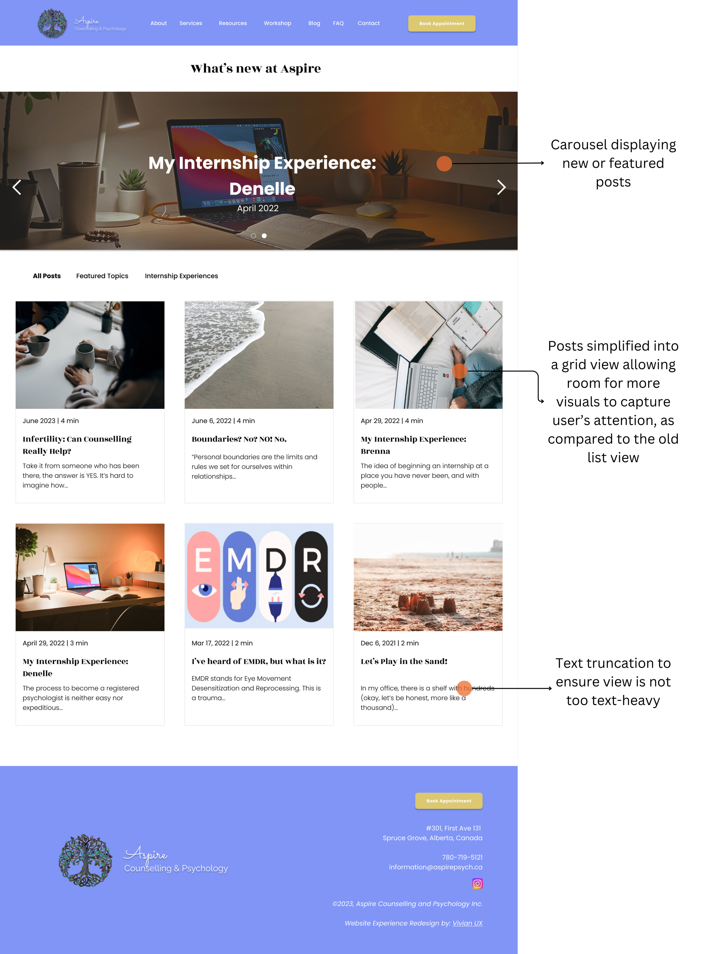
Blog

About

Workshop
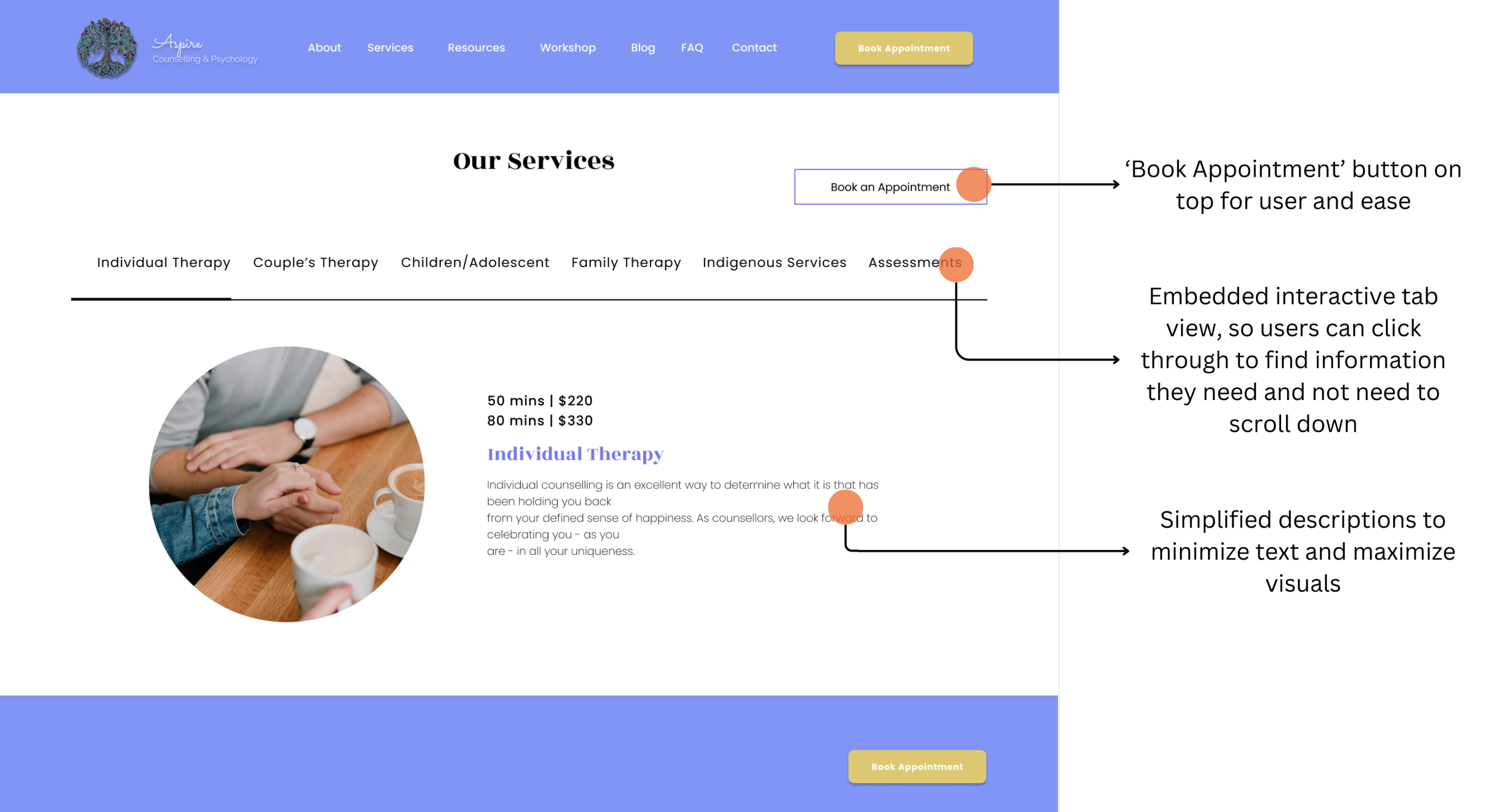
Services
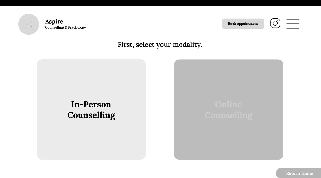
The ‘Find a Therapist’ Matching Tool concept couldn’t work.
Before starting the high-fidelity prototypes, the client and I discussed ways we would embed this conditional-logic tool onto the site, where their choice of website builder is WIX.
At the time, WIX did not have their own built-in function to add these types of conditional-logic forms, instead they only had functions to add an embed third-party widget. They had the option to add embed code, however, my level of coding was not yet at the expertise of creating a form for this tool. Additionally,
All of the embed tools we tried required a monthly subscription/cost, but the client did not wish to spend this extra cost as it was outside their budget.
Thus, we completely ditched the idea. And moved on.
👩🏻💻Second Round of Usability Testing👨🏽💻
The same previous participants from the first usability testing round were recalled for Usability Testing #2.
Another anonymous System Usability Scale was completed for quantitative measures.
🎯 Key Goals of Usability Test #2
What is the first thing that users would want to do when on their first interaction with the product? Are they able to do it?
At any point does the user become confused when exploring the product?
Are there any distractions or anything that may get in the way of the user or impede them from completing a desired goal?
Are there any features that they completely ignore?
Can users find what they’re looking for?
⭐ Key Findings
⭐ All participants were strongly satisfied with the general interface and overall look of the website
5/5 of users agreed that the general layout of the website to be appealing, according to the System Usability Scale findings
5/5 of users were content with the aesthetics/visual design and sleeker and simpler look
⭐ Participants were still content with the feature and functionality of the website, despite removal of the proposed ‘Find a Therapist’ tool
All staff agreed that the main feature of their site should be their services offered, followed by staff pages
Hotjar analysis shows that the ‘Services’ page still remains top 2 pages that are most popular (along with the Staff About/Meet the Team sections)
✨ A Glimpse of the Final Product ✨
Video demonstrating a general overview of the website.
✨ See for yourself, by searching www.aspirepsychologicalservices.com ✨
Takeways and Next Steps
🌟 Results
A clean, sleek and simplified redesign of the site interface plays a large role in easing incoming users who are looking for help may already feel overwhelmed. Implementing improvements such as clearer action buttons (‘Book Appointment’), quicker ease of access to important features of the site (Services, list of therapists) improved user experience overall, engagement, while deceasing ‘U-Turns’ or ‘Rage Clicks’ and drop-offs, as seen through user behaviour tracking in Hotjar. User navigation & experience was also improved through responsive mobile design. All of these surpassed old version of the website, leaving the clients satisfied with the final product.
🏃🏼 Main Challenges
Two major challenges were encountered; not able to implement the intended ‘Find a Therapist’ tool user flow due to lack of resources as this website refresh was a one-man job including only myself (UX designer/researcher), and the initial colour scheme being at disconnect with the branding of Aspire.
The therapist matching tool on Figma worked well, however, WIX lacked this type of function and required a third-party plugin, which required an additional subscription.
Due to my limited knowledge of this type of plugin development, a need for a front-end developer would be beneficial in making this product a success without additional monthly charges.
Additionally, staff did not have room to invest in a monthly subscription for this plugin, as it was outside of their budget.
After Usability Testing #2, some staff at Aspire felt a disconnect with the current colours in the design system used, and wanted to revise the colours to be consistent with branding while remaining vibrant. These changes are seen in the pages ‘HIFI 2’ and ‘HIFI 3’ in the Figma file.
What’s Next?
Recommendations for the client/website:
Continue to monitor website activity through all platforms
Check-ins with Aspire to share user tracking/website analysis stats pre and post-launch, and to see if there is improvement in web traffic and business metrics
Personal Lessons and Future Steps to Take!
Ensure a proposed solution is feasible before starting it, such as the ‘Find a Therapist’ tool - to save time and resources
Further development in C++, and Javascript to gain more experience in working with embed codes
Practice refining UX artifacts, UX research and design processes from the learnings of this project into future ones